How To Do Mobile App Design
by Harshita Arora
Designing beautiful mobile apps from scratch
I started learning graphic design when I was 13. I learned to design websites from online courses and used to play around with Photoshop and Affinity Designer all day. That experience taught me how to think like a designer.
I've been designing and developing apps for almost a year now. I attended a program at MIT where I worked with a team to develop Universeaty. Two months ago, I started working on a new app, Crypto Price Tracker, which I launched recently on 28th January.
In this post, I'll share the step-by-step design process I follow along with examples of the app I worked on. This should help anyone who wants to learn or improve upon their digital design skills. Design is not all about knowing how to use design software, and this post won't teach you how to use it. There's hundreds of good quality tutorials online to learn. Design is also about understanding your product inside out, its features and functionality, and designing while keeping the end-user in mind. That's what this post is meant to teach.
Design Process:
- Create a user-flow diagram for each screen.
- Create/draw wireframes.
- Choose design patterns and colour palettes.
- Create mock-ups.
- Create an animated app prototype and ask people to test it and provide feedback.
- Give final touch ups to the mock-ups to have the final screens all ready to begin coding.
Let's start!
User-Flow Diagram
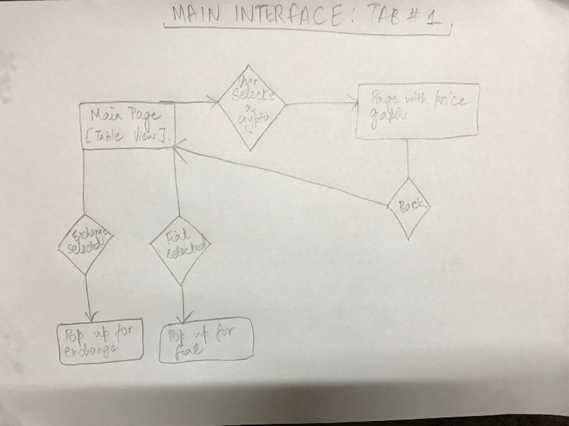
The first step is to figure out the features you want in your app. Once you've got your ideas, design a user-flow diagram. A user-flow diagram is a very high level representation of a user's journey through your app/website.
Usually, a user flow diagram is made up of 3 types of shapes.
- Rectangles are used to represent screens.
- Diamonds are used to represent decisions (For example, tapping the login button, swiping to the left, zooming in).
- Arrows link up screens and decisions together.
User-flow diagrams are super helpful because they give a good logical idea of how the app would function.
Here's a user-flow diagram I drew when I started out working on the design of my app.
Wireframes
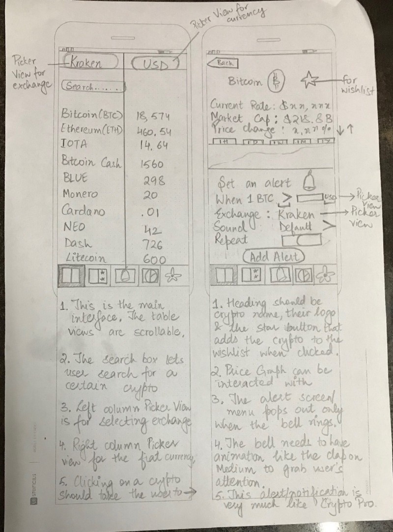
Once you've completed the user-flow diagrams for each screen and designed user journeys, you'll begin working on wireframing all the screens. Wireframes are essentially low-fidelity representations of how your app will look. Essentially a sketch or an outline of where images, labels, buttons, and stuff will go, with their layout and positioning. A rough sketch of how your app will work.
I use printed templates from UI Stencils for drawing the wireframes. It saves time and gives a nice canvas to draw on and make notes.
Here's an example wireframe.
After sketching the wireframes, you can use an app called Pop and take a pic of all your drawings using the app and have a prototype by linking up all the screens through buttons.
Design Patterns and Colour Palettes
This is my favourite part. It's like window-shopping. Lots of design patterns and colour palettes to choose from. I go about picking the ones I like and experimenting with them.
The best platforms to find design patterns are Mobile Patterns and Pttrns. And to find good colour palettes, go to Color Hunt.
Mock-ups
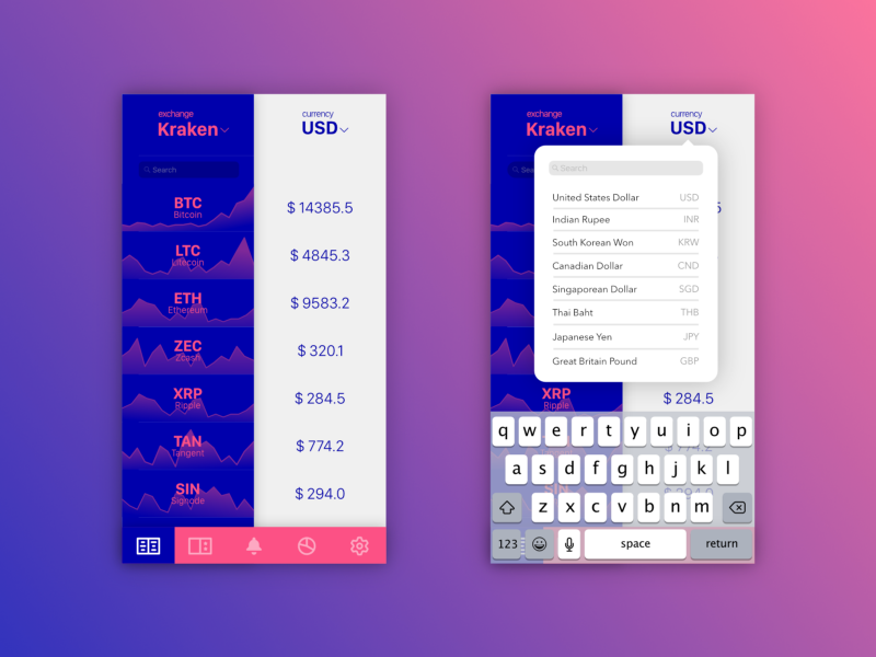
This is when you finally move on to using design software. A mock-up in the design sense is a high-fidelity representation of your design. It's almost like you went into this app in the future and you took some screenshots from it. It should look realistic and pretty much like the real thing.
There are design software and tools for creating mock-ups. I use Affinity designer. The most commonly used tool for iOS design is Sketch.
Here's an example of some of the early designs of my app.
I experimented more with various colour palettes.
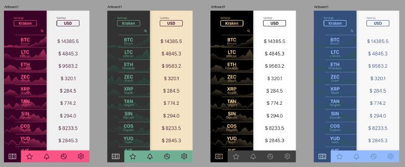
I shared the initial mockups with my friends for their feedback. A lot of people seemed to like the gold gradient and black scheme.
Be willing to take feedback and experiment with new suggestions! You'll find amazing ideas come from your users when you talk to them, not when you frantically scroll through Dribbble or Behance.
So I redesigned the mock-up and removed the background graphs because generating them was a technically time-consuming process and they reduced readability. This is what the redesigned mock-up looked like.
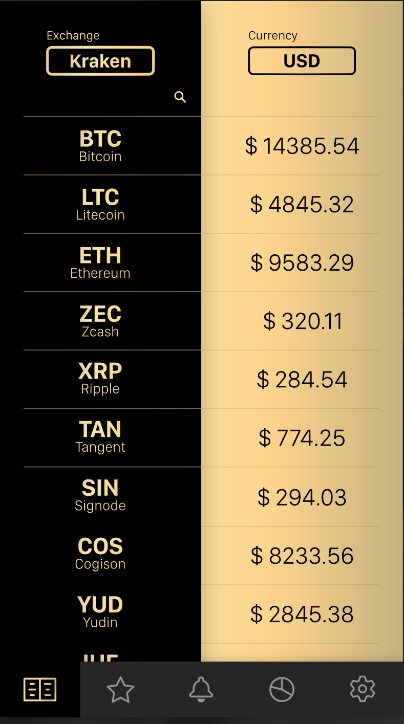
I was pretty satisfied with the colour scheme, icons on the tab bar, and overall layout. I went ahead and designed the rest of the screens following the same design guidelines. It was a long, but surely fun process!
Once all of my screens were ready, I put together a prototype in Adobe XD and asked a few friends to experiment and give feedback.
After final touches and such, this is what my final design looks like.
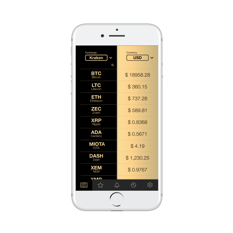
After all the screens were completed, I imported them into Xcode and began coding the app.
That's it! I hope this post will help you get started with app design or help you become a better designer. And if you like my app, you can download it here.
I'm ending the post with one of my favourite quotes about design.
"Design is not just what it looks like and feels like. Design is how it works"
-Steve Jobs
Learn to code for free. freeCodeCamp's open source curriculum has helped more than 40,000 people get jobs as developers. Get started
How To Do Mobile App Design
Source: https://www.freecodecamp.org/news/designing-beautiful-mobile-apps-from-scratch-1a3441ebd604/
Posted by: reedbetheraine57.blogspot.com

0 Response to "How To Do Mobile App Design"
Post a Comment